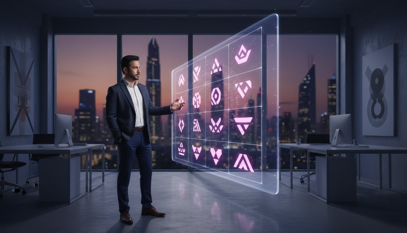
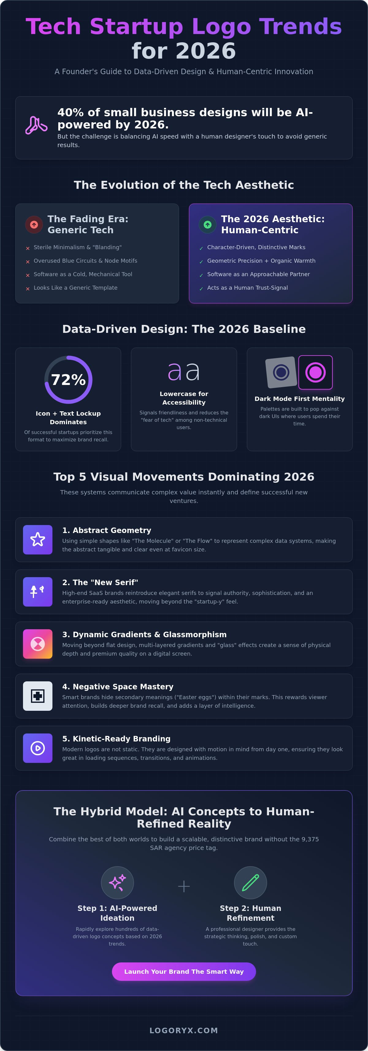
Did you know that 40% of small business designs in 2026 are now powered by AI tools? While speed is essential, many founders in Saudi Arabia fear their brand will end up looking like a generic template. Staying ahead of tech startup logo trends requires more than just a quick prompt; it demands a balance between digital efficiency and the polished touch of a human designer. You want a visual identity that attracts serious investors without spending 9,375 SAR on a traditional agency before you've even launched.
It's natural to feel overwhelmed by technical jargon like SVG paths or the recent 13th edition of the Nice Classification updates. You deserve a logo that feels premium and production-ready from day one. This article promises to decode the data-driven design shifts that define the next generation of tech branding. We'll explore how to move from cold automation toward human-centric innovation, ensuring your brand remains scalable and distinctive. We will preview the rise of adaptive morph-marks and show you how to find that perfect middle ground between instant AI concepts and handcrafted professional quality.
Key Takeaways
- Learn why the era of sterile minimalism is fading in favor of character-driven marks that blend geometric precision with organic warmth.
- Discover the top tech startup logo trends for 2026, including the strategic use of abstract geometry and the return of elegant serifs for high-end SaaS authority.
- Master the 2026 palette by choosing between high-saturation Electric Neons for visibility or Cyber-Neutrals to signal premium enterprise reliability.
- Understand the technical requirements for a production-ready brand, from non-negotiable SVG vectors to responsive logo systems that work on every screen size.
- Explore the hybrid design model that combines rapid AI-powered ideation with handcrafted human refinement to build a solid visual identity.
The Evolution of Tech Startup Logo Trends in 2026
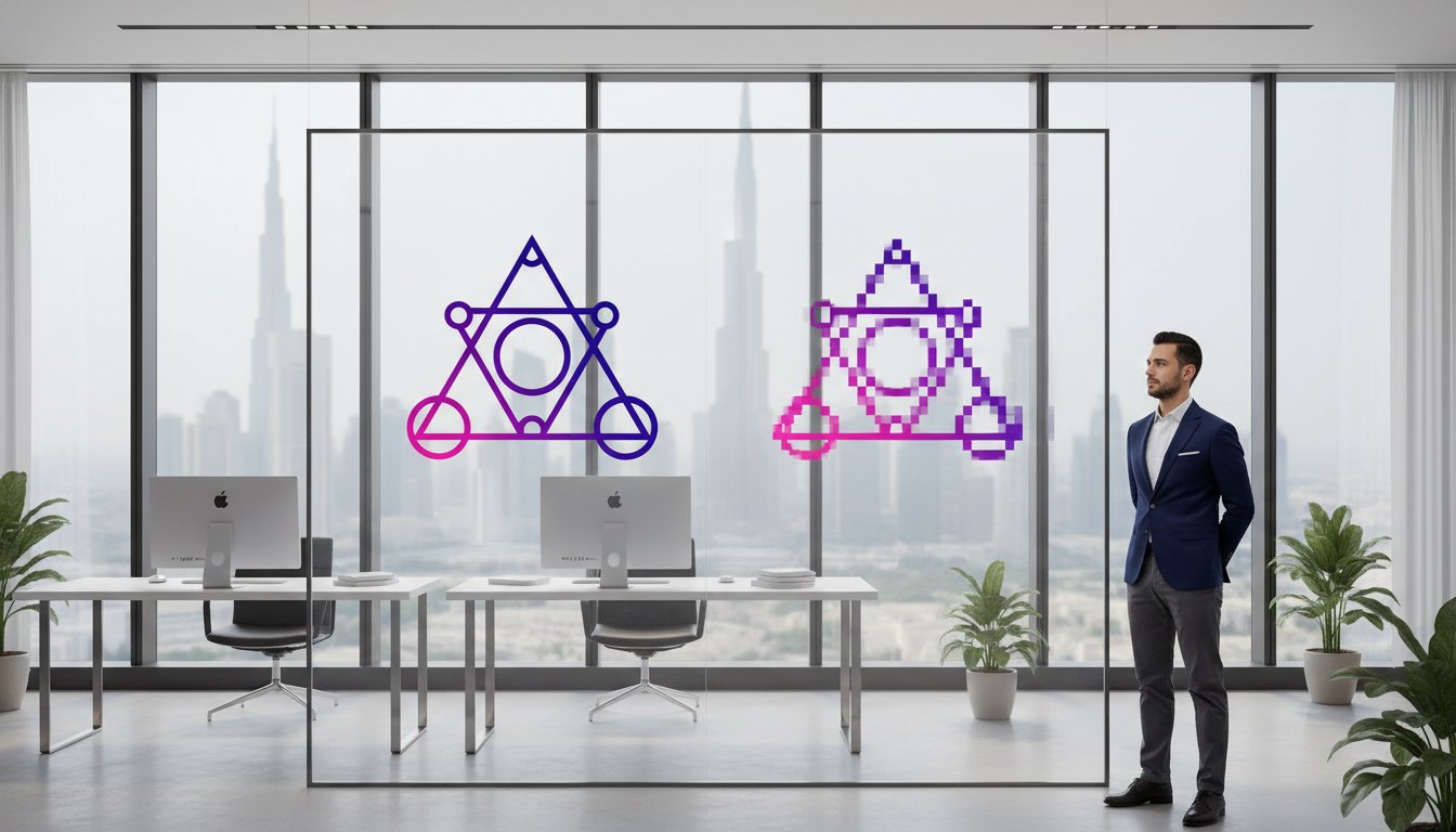
The 2026 tech aesthetic is a sophisticated fusion of geometric precision and organic approachability. As the Saudi tech ecosystem matures, founders are realizing that standing out requires more than a simple sans-serif font. We've moved past the "Blanding" era where every SaaS brand looked like a clone of its competitors. Today, The Evolution of Logo Design has reached a point where character-driven marks are essential for survival. In a landscape crowded with AI and deepfakes, your logo must act as a trust-signal. It needs to prove there's a human heart behind the code. Because most users interact with brands via mobile devices, your logo is now an app icon first and a billboard second. This shift dictates every choice from line weight to color contrast.
The Death of the "Generic Tech" Look
Founders in Riyadh and Jeddah are ditching the overused blue circuit boards and generic node motifs that defined the last decade. These symbols feel like software as a tool, which is a dated concept. Modern tech branding positions software as a partner rather than just a utility. This requires a visual language that feels alive and responsive. Human-Centric Tech stands as the dominant movement of 2026, prioritizing visual systems that feel approachable rather than clinical. By moving away from cold, mechanical symbols, startups can build an emotional connection with their users from the very first pixel.
Data-Driven Design: The 2026 Baseline
Data shows that 72% of successful startups still prioritize the "Icon + Text" lockup to maximize brand recall. While the icons are becoming more intricate and unique, typography is shifting toward lowercase letters to signal friendliness and accessibility. This is a calculated move to reduce the "fear of tech" among non-technical users. Additionally, the Dark Mode First mentality is a core part of tech startup logo trends this year. Designers now build palettes that pop against charcoal and slate backgrounds before they ever consider how the logo looks on a white page. This ensures the brand looks premium in the environments where users actually spend their time. If you're ready to test these aesthetics, you can use an AI logo generator to explore 2026 trends in minutes before committing to a final handcrafted version.
Top 5 Visual Movements Dominating Tech Branding
Identifying the right visual direction is the difference between a brand that feels like a temporary tool and one that feels like a lasting institution. In the Saudi market, where the 2026 tech landscape is rapidly expanding, founders need more than just a pretty picture. They need a visual system that communicates complex value instantly. These five movements are currently defining tech startup logo trends across the most successful new ventures.
- Abstract Geometry: Startups are using simple shapes to represent complex data systems, turning the abstract nature of code into something tangible.
- The "New Serif": High-end SaaS brands are reintroducing elegant serifs. This signals authority and sophistication, moving away from the "startup-y" feel toward an enterprise-ready aesthetic.
- Dynamic Gradients: We've moved beyond flat design. By utilizing "glass-morphism" and multi-layered gradients, designers create a sense of physical depth on a digital screen.
- Negative Space Mastery: Smart brands hide secondary meanings within their marks. This "Easter egg" approach rewards viewer attention and builds deeper brand recall.
- Kinetic-Ready Branding: Modern logos aren't static. They're designed with motion in mind, ensuring they look just as good during a loading sequence as they do on a business card.
As noted in the latest report on 2026 Logo Design Trends, the focus has shifted toward high-utility marks that don't sacrifice artistic intent. If you're looking to experiment with these styles, you can begin by generating AI logo concepts to see which movement resonates with your team.
Abstract Shapes and Data Visualization
Founders are increasingly adopting "The Molecule" or "The Flow" motifs to represent connectivity and seamless integration. These geometric icons perform significantly better as favicons and social avatars because they maintain clarity even at 16x16 pixels. The challenge lies in finding the balance between a "techy" look and a "clean" finish. A solid geometric mark should feel mathematically perfect yet approachable, avoiding the jagged, harsh lines of early 2000s computing.
Typographic Innovation: Beyond Helvetica
While the icon is important, a unique wordmark is often the ultimate differentiator for a premium brand. Many startups now mix font weights, combining bold and light variations within a single word to emphasize different parts of their brand name. This creates a visual rhythm that guides the eye. Despite these innovations, over 90% of tech startups still choose Sans-Serif for their primary wordmark because it ensures maximum digital legibility across various screen resolutions and lighting conditions.
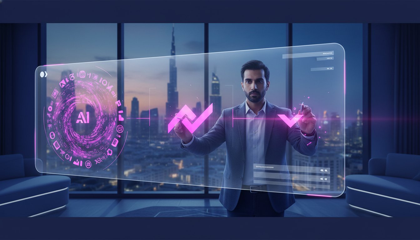
Color Psychology: The 2026 Tech Palette
Color is the silent communicator of your brand's intent. While older reports might suggest that blue is the only way to signal trust, the actual tech startup logo trends of 2026 show a much more vibrant shift. Founders are now using "Electric Neon" palettes to cut through the digital noise of saturated marketplaces. These high-saturation colors ensure your app icon doesn't get lost on a cluttered smartphone screen. Conversely, we see a rise in "Cyber-Neutrality" for enterprise-level software. Using slate, charcoal, and off-white creates a sense of "Premium" stability that appeals to corporate decision-makers in Riyadh's growing financial districts.
In sectors like Climate-Tech and Bio-Tech, "Sustainability Green" has evolved. It's no longer just a forest green; it's a digital, luminous emerald that feels both organic and high-tech. Beyond aesthetics, accessibility has become a non-negotiable design requirement. High-contrast ratios are now a standard part of a solid visual system. This ensures that users with visual impairments can interact with your brand effortlessly, which is a key component of modern ethical branding standards in the Kingdom.
Primary Colors vs. Secondary Accents
Choosing a "Hero" color requires testing across both light and dark UI themes. A shade that looks vibrant on a white background might wash out on a dark mode interface. To maintain brand consistency, follow the "Gradient-to-Solid" rule. This means your logo should look just as impactful in a single solid color for print as it does with a complex gradient on a screen. Data shows that 51% of tech logos incorporate black or deep navy as a grounding element. This provides a professional anchor for more adventurous accent colors, ensuring the brand feels "production-ready" rather than experimental.
The Psychology of "AI-Purple" and "Innovation Orange"
Purple has firmly established itself as the unofficial color of the AI revolution. It combines the stability of blue with the energy of red, suggesting a "magical" yet logical intelligence. On the other hand, "Innovation Orange" and coral tones are being used to signal disruption in stagnant industries like logistics or traditional banking. To avoid "Color Fatigue," smart founders use muted secondary palettes. This allows the primary brand color to pop without exhausting the user's eyes during long sessions. Whether you start with AI concepts or move straight to a human-crafted brand identity, choosing the right palette is the first step toward a polished, professional presence.
Technical Standards: Why "Production-Ready" is the Only Trend That Matters
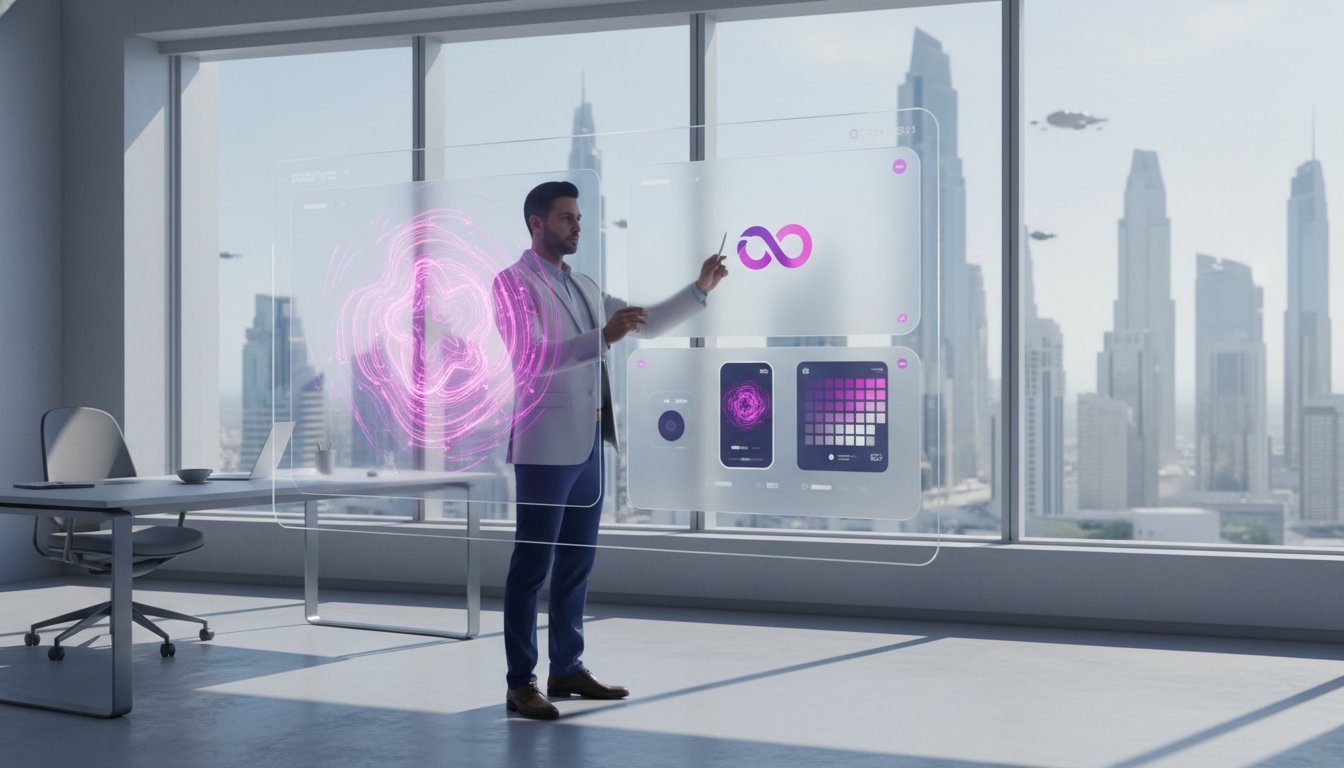
Aesthetics are the bait, but technical standards are the hook that keeps your brand from falling apart as you scale. In 2026, tech startup logo trends aren't just about what looks good on a mood board; they're about what performs on a dashboard. If your logo is just a high-res PNG, you're already carrying technical debt that will haunt your developer team. A "production-ready" visual system is the only trend that truly matters for founders who plan to move from a seed round to a Series A. Adopting these technical standards requires a shift in how you view your brand assets.
The SVG Mandate is now non-negotiable. Scalable Vector Graphics are code-based files that stay crisp at any size. Because they're lightweight, they significantly improve your site's Largest Contentful Paint (LCP). A heavy, unoptimized logo file can actually drag down your SEO performance. Beyond speed, you must implement a responsive logo system. This includes "Stacked," "Horizontal," and "Icon-Only" variations to ensure your brand fits perfectly in every digital corner. You need a system that adapts to its environment without losing its core identity.
Scalability and the Vector Advantage
Manual vectorization is vastly superior to automated "trace" tools. While AI can generate brilliant concepts, the resulting paths are often messy and inefficient. Handcrafted vector refinement ensures clean lines and mathematical symmetry. This level of polish is why your AI logo needs SVG files that have been manually reviewed. It's the difference between a logo that looks "okay" and one that feels premium on a 4K monitor. A clean vector file ensures your brand remains sharp whether it's on a business card or a giant office sign.
Design for the Modern Tech Stack
Your mark must survive the Favicon Test. If your icon becomes an unrecognizable smudge at 16x16 pixels, it won't work in a browser tab. Many modern tech startup logo trends focus on how a mark adapts to social media kits and circular profile pictures. You also need to consider the "App Icon" grid. Both iOS and Android have strict padding and corner radius guidelines. If your logo isn't designed with these constraints in mind, it will look amateurish on a user's home screen. Finally, prepare for your physical launch. When you order your first batch of startup swag in Riyadh, your printer will require CMYK vector files. Using RGB screen colors for physical printing often results in dull, muddy hues that don't match your digital presence.
Don't let technical limitations slow your growth. You can start with an AI concept and upgrade to a production-ready vector whenever you're ready to scale.
Launching Your Brand: From AI Concepts to Human-Refined Reality
Speed is the primary currency of the Saudi startup scene. Founders in Riyadh and Jeddah often feel the pressure to launch a visual identity overnight to secure their place in the market. You can use an AI logo generator to explore 2026 trends in minutes; however, speed should never come at the cost of professional quality. The Logoryx philosophy is built on a "start-then-scale" logic. We leverage AI for rapid ideation while relying on human designers for premium execution. This hybrid approach allows you to stay ahead of tech startup logo trends without falling into the generic trap that plagues many automated platforms. You can start with a low-risk, credit-based concept and upgrade your assets as your user base grows.
The "Upgrade Anytime" path is designed for modern entrepreneurship. It acknowledges that a brand is a living system that matures over time. That final 5% of human refinement is what separates a side project from a serious, venture-backed competitor. While an algorithm can suggest a color palette, a human designer understands the cultural nuances required to build trust in the Kingdom's tech sector. This transition from a digital concept to a polished, production-ready brand is what signals to investors that your team is ready for high-level professional collaboration.
Avoiding the AI-Generated Trap
Purely AI-generated logos often suffer from the "uncanny valley" of design. You might notice asymmetrical lines or mathematically weird geometry that feels slightly off to the human eye. These small errors create technical debt and signal a lack of professional oversight. Custom typography is the most effective way to make a generated mark feel handcrafted and unique. By utilizing a manual vector upgrade, you ensure your concept is free from digital artifacts and ready for any screen resolution. This process turns an interesting concept into a solid visual system that can anchor your entire company's presence.
Your 24-Hour Branding Checklist
Building a brand doesn't have to take months. Follow this streamlined path to go from a blank slate to a premium identity in a single day:
- Step 1: Generate 20+ concepts based on current 2026 tech trends to see which visual movements resonate with your product.
- Step 2: Select your top 3 favorites and test them as favicons and social icons to ensure they maintain legibility at small sizes.
- Step 3: Upgrade to a manual SVG and refine the mark with a professional designer for that essential "Premium" finish.
This modular journey ensures you aren't overspending in the early stages of your startup. You have the flexibility to move from a simple concept toward a full brand identity design when your team is ready to scale. By combining technological efficiency with artisanal quality, you create a brand that is both modern and timeless.
Build Your Future-Ready Tech Brand Today
You now have the strategic blueprint for a visual identity that thrives in the 2026 landscape. We've explored how the shift toward character-driven marks and high-utility technical standards is redefining the industry. Staying ahead of tech startup logo trends requires moving beyond the "uncanny valley" of basic automation. You need a visual system that is responsive, accessible, and ready for the global stage. Logoryx offers a unique hybrid AI and human designer model that bridges the gap between instant ideation and handcrafted precision.
With over 10,000 founders worldwide already trusting our platform, we provide the production-ready SVG upgrades necessary for true scalability. You don't have to choose between a cheap template and an expensive agency. Our modular approach allows you to start fast and refine as you grow. Start generating your tech startup logo concepts on Logoryx today and transform your vision into a premium brand that attracts both users and investors. Your startup deserves a logo that works as hard as your code does. We're ready to help you make your mark on the Kingdom's tech ecosystem.
Frequently Asked Questions
What are the biggest tech startup logo trends for 2026?
The most significant tech startup logo trends for 2026 center on "Human-Centric Innovation" and "Kinetic-Ready" designs. We've moved beyond cold automation toward visual systems that feel approachable and responsive. This includes the use of high-saturation palettes to cut through digital noise and abstract geometry to represent complex data connectivity. These trends prioritize accessibility and technical scalability across diverse mobile environments, ensuring your brand remains modern and trustworthy.
Should I use a serif or sans-serif font for my tech company?
Sans-serif fonts are the primary choice for digital legibility, but elegant serifs are returning for brands seeking a premium, authoritative feel. Most tech founders prefer sans-serif because it maintains clarity across various screen resolutions and lighting conditions. If you're building a high-end SaaS platform, a custom serif can provide the sophisticated edge that distinguishes you from the sea of generic minimalist brands currently flooding the market.
Why do so many tech startups use the color blue?
Blue has historically dominated the industry because it triggers psychological feelings of trust, security, and logic. In the competitive Saudi market, many established firms use blue to signal reliability. However, 2026 palettes are shifting toward "Cyber-Neutrals" like slate and charcoal for enterprise software. While blue remains a solid choice, adding high-saturation accent colors helps your brand stand out in a sea of safe corporate identities.
Can I use an AI logo generator for my official startup brand?
You can certainly use an AI logo generator for your official brand as long as you include a human refinement stage. AI is excellent for rapid ideation and exploring modern aesthetic movements in minutes. However, raw output often lacks the technical precision required for a production-ready visual system. By selecting a generated concept and upgrading it with a manual vector polish, you get a unique, venture-backed look.
What is a vector file and why does my logo need one?
A vector file is a graphic built from mathematical paths rather than individual pixels. Your logo needs one because vectors like SVGs can scale infinitely without losing clarity or becoming blurry. They're also essential for modern web speed, as they help reduce your site's Largest Contentful Paint. Without a production-ready vector, your brand will look amateurish on high-resolution screens or large-scale prints during a physical launch.
How much does a professional tech logo design cost in 2026?
Professional logo costs vary significantly based on the service tier you choose. In 2026, hiring a design agency in Riyadh or Jeddah typically starts at a minimum of 9,375 SAR, with some fees reaching 37,500 SAR. Freelancers on global platforms range from 937 SAR to 9,375 SAR depending on experience. For founders on a budget, the hybrid model of AI ideation followed by handcrafted refinement offers a high-value alternative.
What makes a logo look "premium" versus "cheap"?
Premium logos are defined by custom typography, balanced white space, and mathematical symmetry. A cheap logo often relies on overused motifs like generic circuit nodes or has asymmetrical lines from unrefined AI output. To look venture-backed, your mark must feel intentional and polished. This handcrafted finish ensures your brand identity stands out as a unique asset rather than a generic template used by thousands of other creators.
How do I ensure my logo looks good in dark mode?
To ensure your logo looks good in dark mode, you should adopt a "Dark Mode First" design strategy. Test your primary brand colors against charcoal and slate backgrounds early in the design process. You may need to create a slightly inverted or higher-contrast version of your logo specifically for dark interfaces. This ensures your brand remains vibrant and accessible, regardless of the user's preferred device settings or environmental lighting.